

Your product doesn't need a redesign.
Ferrari, Bloomberg, Amazon, and when products don't need to be redesigned.

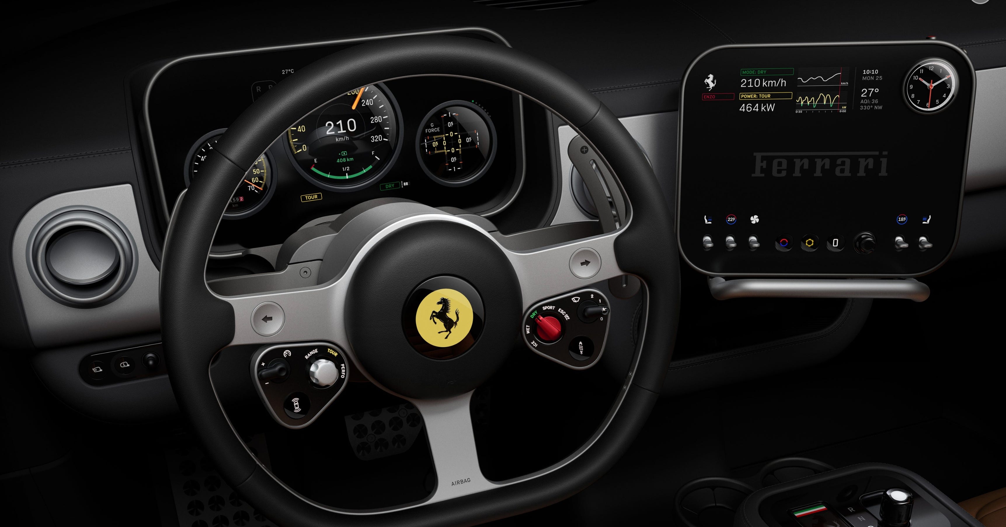
The recent reveal of Ferrari’s new electric vehicle, the Ferrari Luce, got me thinking about redesigns and how customers react when iconic products evolve.


The Luce’s interior was led by Jony Ive’s (the man responsible for the iPhone’s design) design firm, LoveFrom. Naturally, the internet declared it “the Apple Car we never got.” Check out the key design elements here, which include a mix of highly tactile buttons and digital elements.
As with any re-imagining, the reactions were mixed.
Brett from Design Joy had an interesting take on how the design process failed because of an overemphasis on the agency’s fancy research process instead of focusing on the customer and the brand heritage.
“LoveFrom spent six months researching Ferrari's interior redesign. They delivered four books of research before a single design concept was even presented. Six months. Four books. For Ferrari, one of the most iconic brands on the planet.
And the result? It looks like it belongs in a Fiat.” @BrettFromDJ
On the other hand, many car enthusiasts argue the design is a huge leap forward in how car manufacturers reconcile physical controls and digital screens.


I’m not a huge car enthusiast myself, but my husband is, and he constantly complains about how car manufacturers have replaced intuitive tactile buttons with oversized tablet screens, even for functions that clearly shouldn’t require navigating a touchscreen.
From that lens, Ferrari’s approach actually feels pretty balanced. But my point isn’t about whether the Ferrari Luce is well-designed or not.
Ferrari criticisms lead to a deeper question about redesigns, like:
Why are some products never redesigned?
Why are some redesigns successful, while others face backlash?
And when is the right time to reimagine your product?
I’ll tackle the first question in this post, the other questions deserve their own post.
Why some products are never redesigned, and they’re doing just fine
Two products immediately come to mind:
The Bloomberg Terminal
Amazon’s shopping experience
Neither of these products win design awards. Yet both dominate their industries.
1. The Bloomberg Terminal Effect
When your product is hard to learn, a redesign can cause more harm than good.
The Bloomberg Terminal is a staple of the financial industry, it provides financial professionals with access to market & financial data. Even though it costs $25,000-$30,000 per year, financiers, bankers, and governments will happily pay for access to the data.

The interface? Well, let’s just say the word “terminal” is accurate.
There’s entire courses dedicated to learning this software.
As a simple example, users need to memorize keyboard commands like <TICKER> <EQUITY> <GO> for company info, CN for news, and GP for price graphs.
Once you learn the commands, the system becomes incredibly fast. Faster than clicking through menus ever could be.
Here’s the reality:
If Bloomberg “modernized” the UI in a meaningful way, it would destroy years of accumulated muscle memory.
The product’s complexity is part of its moat.
In Bloomberg’s case, the design is not the product. The functionality is.
Redesign Principle #1: If redesigning forces users to relearn core workflows, you risk breaking what actually makes the product valuable.
You may be wondering: won’t some AI start-up (maybe Perplexity?) disrupt Bloomberg if they don’t redesign? We’ll tackle this topic in Part 2, when to know it’s time to redesign.
2. The Amazon Effect
If it works at scale, why touch it?
Amazon’s shopping experience is cluttered, busy, chaotic, and old-school. It hasn’t meaningfully evolved visually in years.
And yet, retail sales and sales from third-party sellers still make up the majority of Amazon’s booming $717B business.
On the one hand, I always wondered why a behemoth like Amazon didn’t clean things up, but on the other hand:
Why would they?
With one of the widest customer bases on the planet, a redesign would create a cascade of potential problems for them:
Hundreds of millions of users would have to re-learn the UI
Third-party sellers depend on specific layouts and placement
Every change risks conversion rate volatility
and of course there would be everyone’s “design opinions” to deal with.
As the classic saying goes, if it’s not broken, don’t fix it. If the UI already converts, and converts at massive scale, a redesign must prove it moves the needle meaningfully.
Redesign Principle #2: If a redesign won’t materially improve business metrics or move the product forward, it’s vanity. You are redesigning for design’s sake.
Why Teams Redesign Products
Redesigns feel like progress: it’s visible, exciting, and flashy.
But it’s often a substitute for harder problems:
Growth stalled? Redesign.
Competitor threat? Redesign.
Revenue under pressure? Redesign.
Thoughtful, successful redesigns happen for one of two reasons:
Because your product must evolve to unlock the next era.
Because it will materially improve your business.
Not because it’s been a while. Not because a new design language is trending. Not because rounded buttons are “in” instead of square ones. Not because your design team wants a portfolio refresh.
Your product doesn’t need a redesign just because it looks old. It needs one only if the current design is limiting growth, limiting business performance, or blocking the future.
Next week, we’ll talk about successful redesigns, and when you should redesign your product.
This is a related article to help launch mobile app
https://iruafeimi.substack.com/p/how-to-build-a-mobile-app-mvp?r=57lqd9&utm_medium=ios