

Your Product Needs Simple Mode.
The case for building Simple Mode, even when you think your product is too complex.

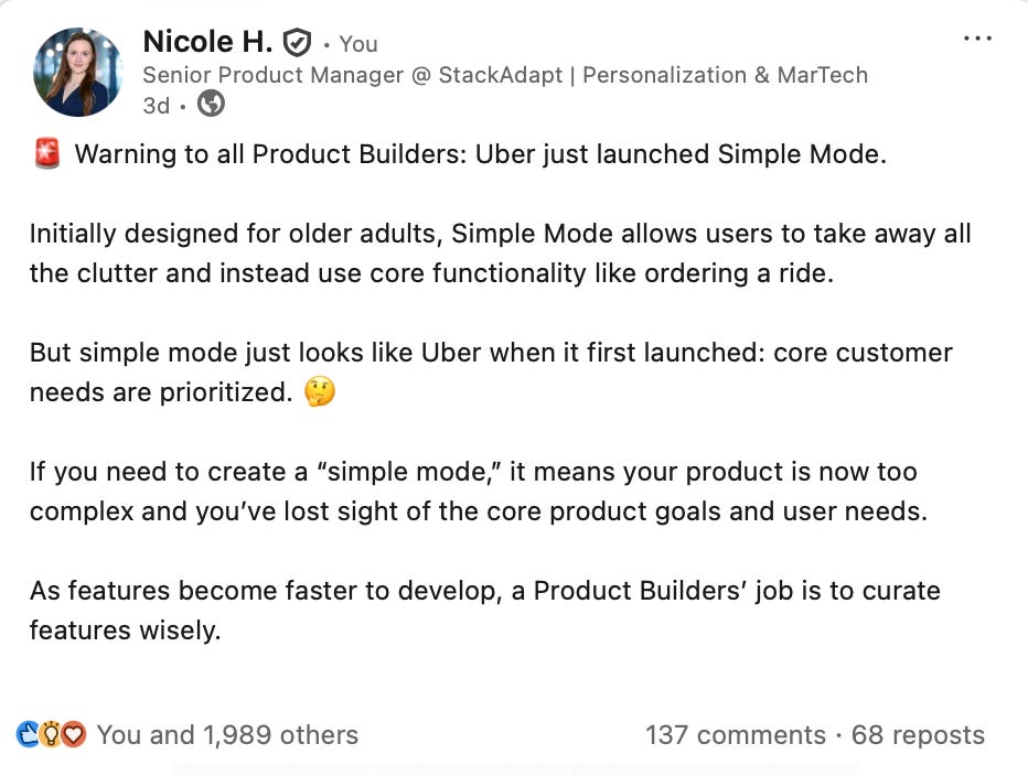
Last week’s snippet on Uber’s Simple Mode took off on LinkedIn, so I thought we should double-click on Simple Mode.
This post resonated with Product Builders because it’s something we’ve all felt:
🤦 Strategy sprawls into unclear, sometimes contradictory directions.
🚒 Feature requests flood in without real prioritization
🚨 You’re looking at a roadmap with 17 “top” priorities
‼️ Every stakeholder insists their request is mission-critical
And that’s how complexity creeps in.
An extra setting here, a new tab there, a well-intentioned executive telling you:
“an extra pop-up never hurt anybody” 😅
Yes, we all want to turn on Simple Mode.
How Uber Got to Simple Mode
Uber’s feature sprawl wasn’t a mistake, it was an intentional choice to create a super-app.
As Dara Khosrowshahi, Uber’s CEO, announced in 2019: they had ambitions to become “the operating system for your everyday life.” (Great article about Uber’s super app ambitions here).
And they executed: Uber tried to become a super-app by layering in food, grocery, delivery, reservations, and rental cars (to name a few).
From a business perspective, this makes a lot of sense:
More offerings = more data
More data = more marketing personalization
More marketing personalization = more spend
But for many customers, the clutter outweighs the convenience. They are simply not interested in all these options.
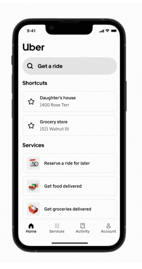
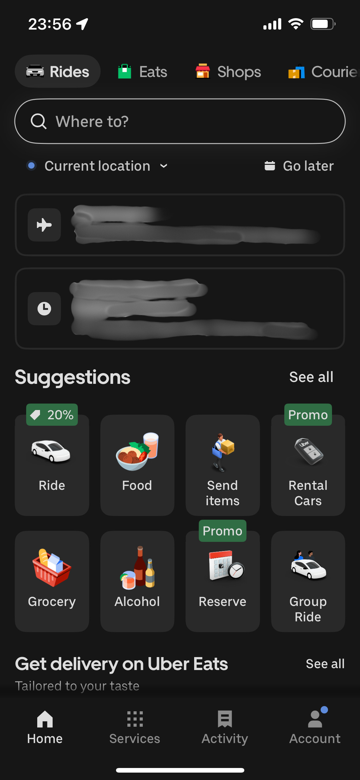
Simple Mode strips it back to tap → ride.
“What about apps and products for advanced topics and users?” -Romain Thibault
Some of the comments on my LinkedIn post about Uber got me thinking more deeply about when Simple Mode does & doesn’t apply, so I wanted to elaborate on some common anti-patterns that prevent teams from building simple products.
OpenAI’s Version of Simple Mode
With the release of Chat GPT-5, OpenAI also made a powerful product decision: let the AI decide which model to use. No more model-switchers.
For most users, this is perfect. The vast majority don’t know (or care) about the differences. Removing the decision point removes friction.
But after a lot of passionate feedback from the user community, OpenAI rolled out the ability to show legacy models within the settings panel.
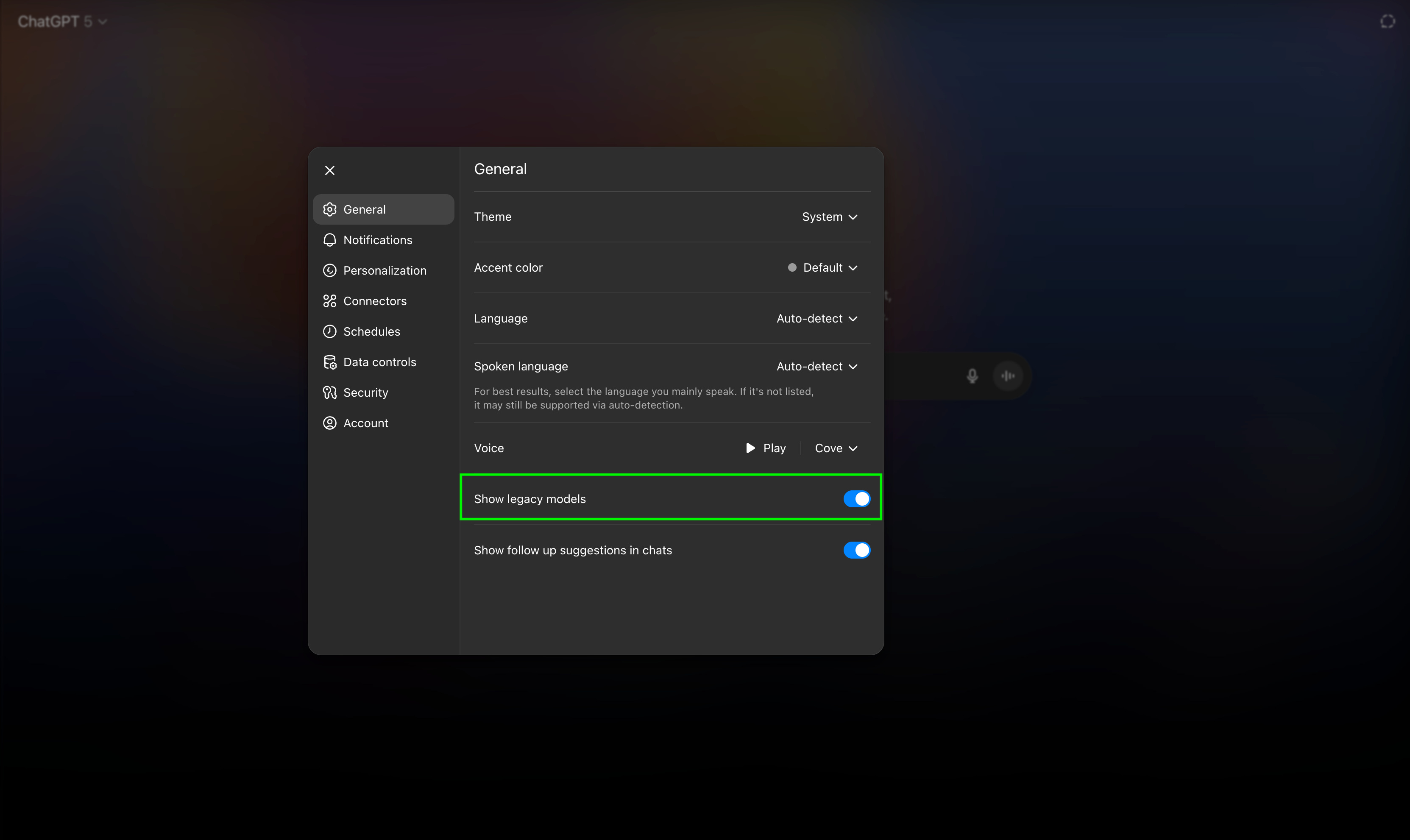
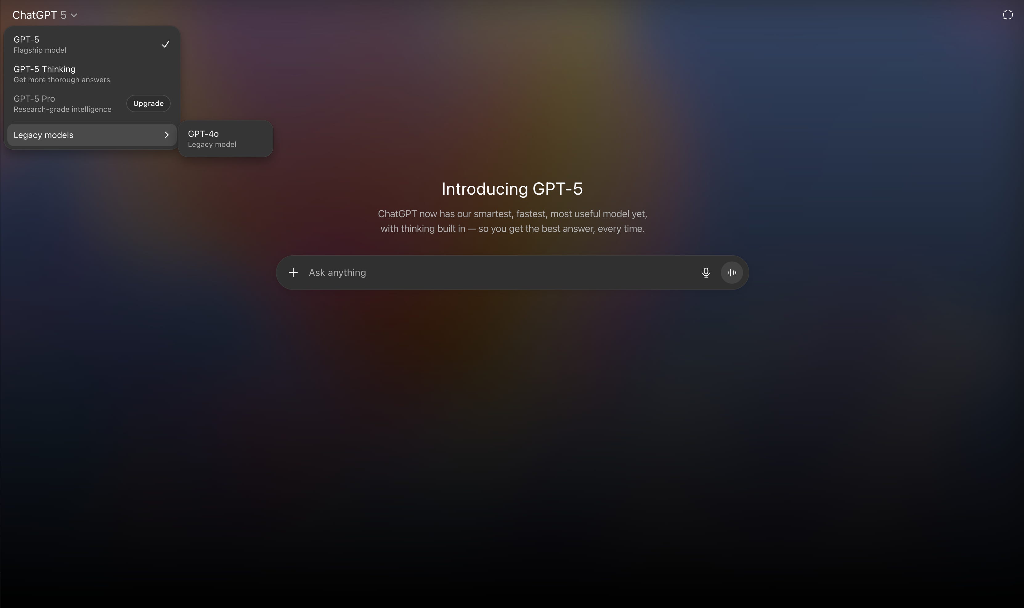
There will be users who prefer the fine-grained control over their model selection.
That’s the balancing act for OpenAI and Product Builders everywhere: strip away complexity for 80% of users, but keep an escape hatch for the 20% who want control.
But here’s the important nuance: in most cases, Builders should strive to make Simple Mode the default.
There’s 5 anti-patterns stopping teams from building simple, straight-forward products.
The good news is, you can fix it. 💪 Here’s how:
Anti-Pattern #1: “Our users know what they’re doing.”
I see Product Teams often say:
“Our customers are experts, they’ll be fine.”
You know who else thought that? PayPal.
In the early 2000s, PayPal had the market-share and the brand. But their API was notoriously clunky.
Developers, literally the most technically adept users on the planet, found it difficult to integrate.
Then Stripe showed up. Their bet? Make payments developer-first:
☑️ Easy-to-work-with, flexible APIs
☑️ Amazing documentation
“Stripe, on the other hand, is a pleasure to integrate. Their API is very straight forward, easy to work with and their documentation is fantastic. Their API makes sense and is laid out very well. PayPal's makes no sense at all” -@WDKevin on r/StartUps
PayPal assumed technical skill meant tolerance for complexity. Stripe proved that even power users prefer an intuitive, low-friction path.
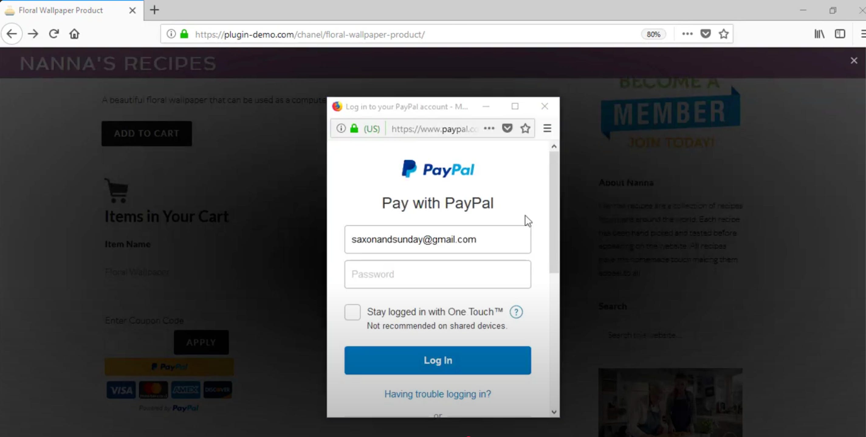
And from a user’s perspective, you can pay without needing to sign up for a PayPal account. That takes the payment flow down from 3-4 screens, to just 1.
Simple mode for developers & the end-user = a win-win.
And that’s why Stripe won the payments game.
Anti-Pattern #2: “Our product is meant to be complex.”
The thinking is:
“The product functionality is powerful, so the product is, by definition, complex.”
Here’s why that’s flawed:
The domain complexity is already a cognitive load for the user. Your job is to remove complexity, not add to it.
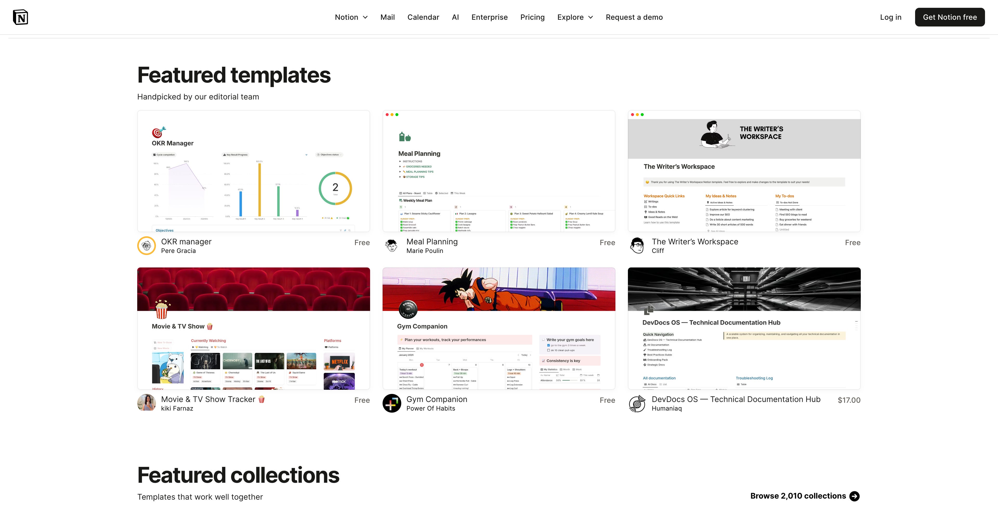
Notion is a masterclass in minimalism with powerful functionality sitting under the hood. Notion gives users the flexibility to create databases, automations, kanban boards, small business operating systems: you name it, Notion can probably do it.
But the default user experience is a blank page.
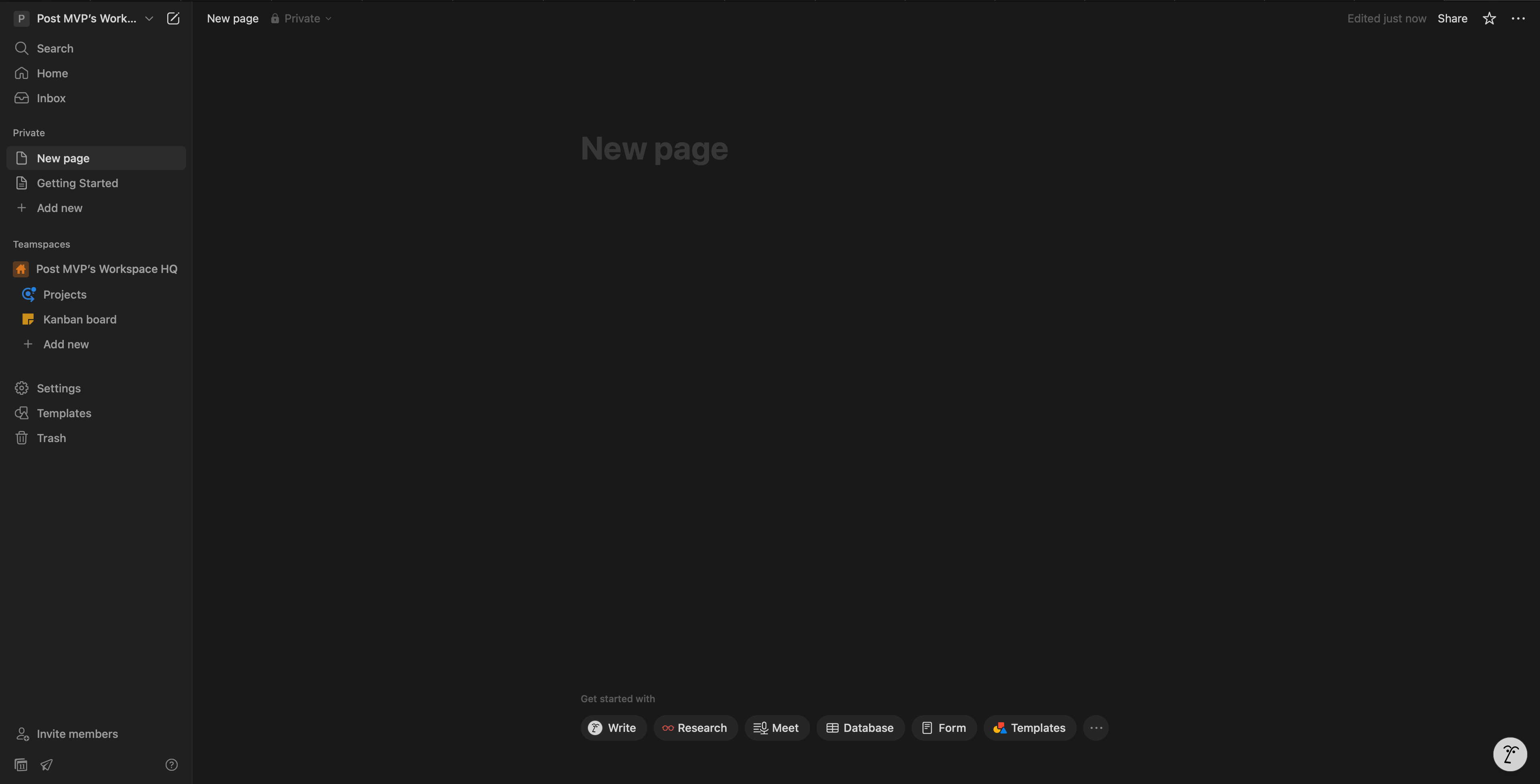
For users to realize the full functionality, Notion created Notion Templates, a gallery of pre-built templates, with templates contributed by the user community.
Notion Templates have been a huge success and become a full-fledged ecosystem of their own. It’s such a hit that there’s a whole creator economy around selling Notion Templates.
Anti-Pattern #3: “This is how our customers are used to doing it.”
A great story from Lenny’s Newsletter came across my feed this week about Bret Taylor, who originally launched a failed product called Google Local which eventually became Google Maps.

Bret Taylor’s early Google Local was basically a digitized Yellow Pages. Users saw a list of businesses, addresses, and phone numbers, with a tiny map in the corner.
When the team decided to flip the UI to put the map at the center, Google Maps exploded. It wasn’t what users were “used to”, but it was better for discovery and navigation.
")
Especially when they’re uncertain, product teams often default to:
how users are used to seeing things in competitive products
how a paper-based process is done
an “existing pattern” elsewhere in the product
how legacy workflows operate.
But exceptional product leaders push the boundary of what users are used to doing, and think of ways to simplify the workflow.
Anti-Pattern #4: “Our users demand a lot of settings.”
Some customer segments do need deep configuration & advanced settings.
Shopify’s core user group is a prime example: eCommerce merchants with highly-specific needs.
But even Shopify introduced its own Simple Mode: the Starter plan.
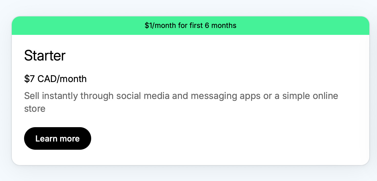
Instead of all the bells & whistles of the full Shopify product suite, the Starter plan allows sellers to go back to the basics with:
☑️ Payments
☑️ Basic product pages
☑️ Optimized for selling on social
It’s a strategic wedge. Starter Plans unlock an entirely new segment: people who don’t want to or don’t know how to run a full-scale eCommerce store. And if their side hustle takes off, they can graduate to the higher tiers. Win-win for Shopify & their customer.
Sometimes your core product can’t be simple, but you can enable Simple Mode as a market expansion tool.
Anti-pattern #5: “The product I’m working on is too complex, I won’t be able to change it.”
If you’re reading this and thinking, “I won’t be able to make Simple Mode happen in my org”, I hear you.
Many of us operate in multi-PM, multi-exec environments, with years of baggage. The product’s complexity is almost…structural.
You can’t flip a switch and overhaul the whole product overnight. Trust me, I get it!
In those cases, zoom in. Think about what Simple Mode could mean for your corner of the product.
You might chuckle a little with this next example, but stick with me 😂

Salesforce is one of the most feature-dense products on the planet. So you can imagine how difficult it would be for a product team to build Simple Mode.
Yet, someone at Salesforce had the foresight to offer pre-configured dashboards by role. Power users can dive into the deep end, but newcomers can start with something usable on day one.
Even in complex environments, you can:
✅ Ship pre-built templates or guided set-ups
✅ Offer role-specific configurations
✅ Keep advanced settings accessible, but tucked away
And those small simplifications compound.
When you make your slice of the product easier…
You’ll set an example and the bar for teams around you…
Which will eventually influence the broader product.
How to ‘Toggle on’ Simple Mode
1) You need a North Star Metric
This comment regarding Uber’s Simple Mode summarized the issue well:
“This actually happens when a company hires too many product managers with every PM just prioritizing their product features over other products and no one really cares about the overall experience.” -Dhruv Bhatia
If there’s no clear North Star, each product team will optimize for their own product KPIs without thinking about the broader good.
If you’re a Product Leader or Executive, make sure everyone on your team knows the North Star metric.
And if you’re a do-er, seek clarity from leadership on what the North Star is. And if there isn’t one: help define it.
Here are some examples, courtesy of Shopify:
Facebook → Monthly Active Users
Amazon → Purchases per month
Uber → Rides per week
Now that you see Uber’s North Star Metric, Uber’s Simple Mode makes a lot of sense. And without the North Star Metric guiding thinking & clarity, Uber’s Simple Mode would be difficult to build.
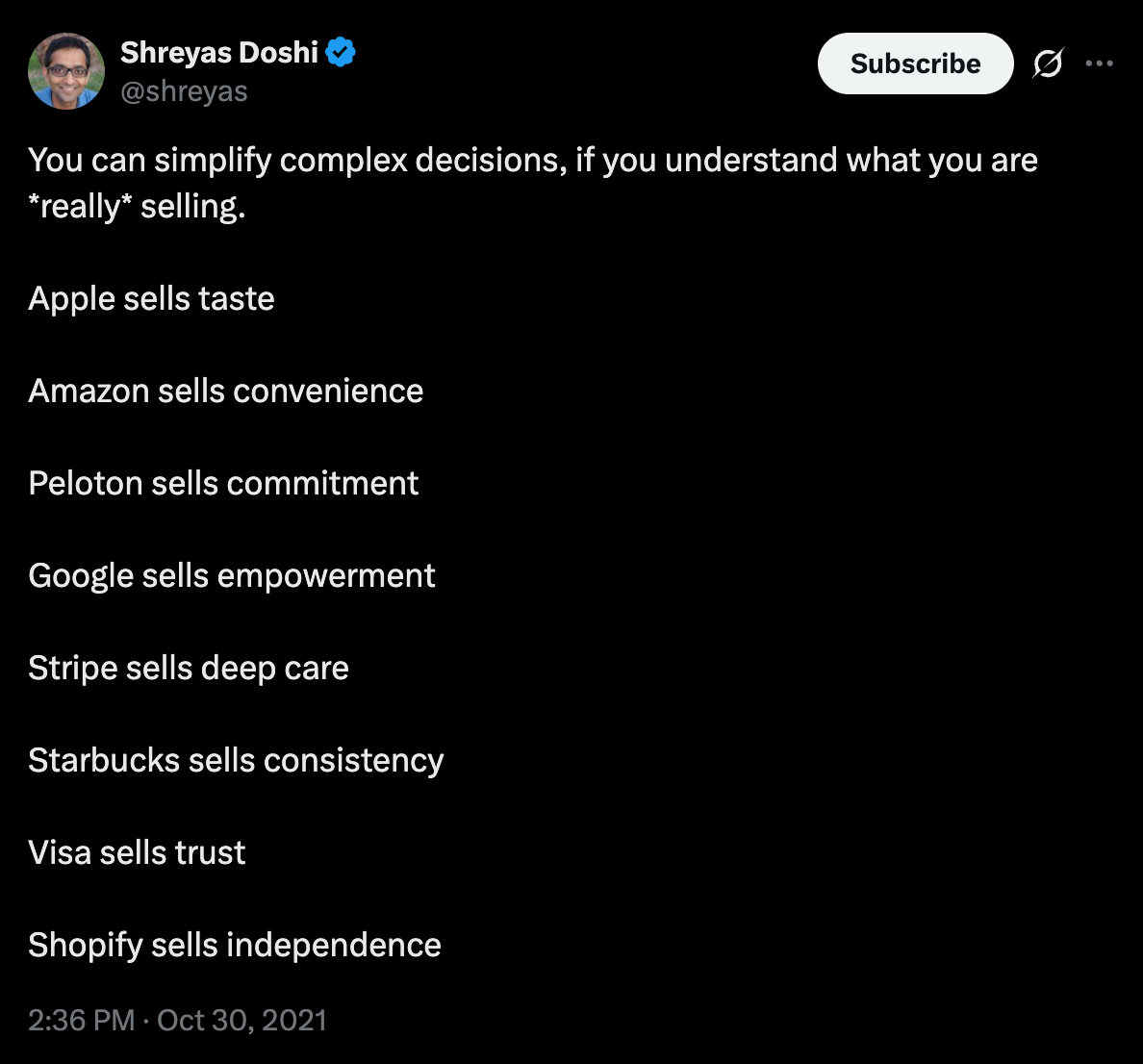
I’ll let Shreyas Doshi have the final word on this, circa 2021.
2) There’s always a way to simplify
Once you know your North Star, driving towards simplicity becomes easier.
Even for highly complex products, you can enable Simple Mode by:
✅ Using pre-built templates or pre-configured settings
✅ Enable progressive discovery of more powerful features
✅ Create role-based experiences
✅ Remove or “tuck away” under-utilized features
✅ Organize the UI by the most commonly used features
✅ Test with users instead of assuming your customers are “power users”
3) Your decisions compound
Your decisions to simplify your corner of a product will compound and push other Builders around you to think differently.
I’ll borrow some wise words from Margaret Mead to close us off:
Never doubt that a small group of thoughtful, committed Product Builders can change the course of a product; indeed, it's the only thing that ever has.