

The Story Behind Air Canada’s Redesign
How We Made Simple Mode the Default at Air Canada.

This week’s post is a personal case study of how I enabled “Simple Mode” for a travel product: the Air Canada homepage.
My mentor, Jose Platero, Air Canada’s Director of Product & Design, is co-publishing on this topic. In this article, you’ll get the tactical, on-the-ground lessons you can apply to any redesign or simplification project. In Jose’s article, you’ll get the leadership lessons on how to drive organizational change forward.
So here’s the story of how we redesigned the Air Canada homepage, and made simple mode a reality.
👉 Each step will be loaded with insights you can use in your own product work.
Why Simple Mode?
The story begins in 2023, when Jose pulled me into a challenge with no roadmap: redesign the Air Canada homepage. There was no brief. No mandate. Just a blank canvas and three goals:
Find the real problem.
Win the collective “go-ahead.”
Deliver a redesign that worked.
It felt less like inheriting a product and more like being handed a blank cheque to change anything, as long as we could prove it worked.
Where we started
Every product eventually gets bloated. More tabs, more buttons, more “urgent” features crammed in over the years.
What was the front door to billions in travel bookings, had become difficult to navigate and crowded. This wasn’t just a design problem or a UX problem. It was a business problem.
When your product starts to look like this:
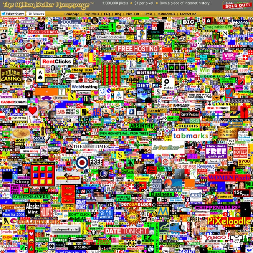
…it’s time to activate Simple Mode.
Here’s how we rebuilt it from the ground up, and why the same playbook works for any product redesign or “Simple Mode” experiment.
1. Get Clear on the Core Revenue Drivers 💸
Although Air Canada’s core business was flights, the homepage was crammed with promotions for hotels, cars, credit cards, and loyalty offers. These were legitimate revenue streams, but they competed with the core action that drove the most value: book a flight.
This was an image from my Product Vision slide deck, no words or fancy charts. When I showed this, it just clicked for people.

In order to design a simplified product, we needed to better understand the revenue drivers. I started interviewing different executives, pouring over the financial statements, and trying to crystallize on what the business priorities were in a forced-rank list.
👉 Builder tip: Before you build anything, map the top 5 revenue drivers of your product, in forced-rank order. Protect them with ruthless focus, or you risk the Where’s Waldo effect.
2. Get Clear on Customers’ Core Actions 💟
As I learned from Chris Ferguson’s Service Design course, the most important part of a product builders’s job is to:
“create win-win experiences for the business and the customer”
It is not enough to prioritize the business and revenue drivers, and build to suit.
We asked: when customers come to aircanada.com, what are they actually here to do?
We pulled analytics and interviewed customers. The forced-ranked list looked something like this:
1️⃣ Book a Flight
2️⃣ Manage a Booking
3️⃣ Check In
4️⃣ Check Flight Status
5️⃣ … then check loyalty / deals
The surprise wasn’t the order, it was how much #5 had been crowding out the top four in product decisions.
Here is an example of what the homepage looked like, circa early 2024. Hotels, credit cards, vacations, and flight deals all catch the user’s eye, when the core action is to search for a flight.
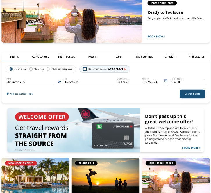
And here is an example of what the homepage looks like 2 years after the initial Beta release. Flight search is front & centre, navigation is logically grouped and minimal, important announcements and offers have room to breathe.
👉 Builder tip: Write down your user’s top 3-5 actions. If your homepage, home screen, or navigation doesn’t reflect these priorities, you’re already creating friction.
3. Design the UI Accordingly 🎨
With the business priorities and customer priorities clarified, I shared the brief with our super-talented design lead, Danielle McLean.
Remember what I said about creating win-win experiences? This is where having both the business and customer priorities clearly outlined matters.
The homepage became a big, bold entry point for booking flights. Adjacent actions (check in, manage bookings, flight status) were grouped logically. Expanding lines-of-business were allocated the real estate they needed to grow, but in the right contextual moment to a user’s journey.
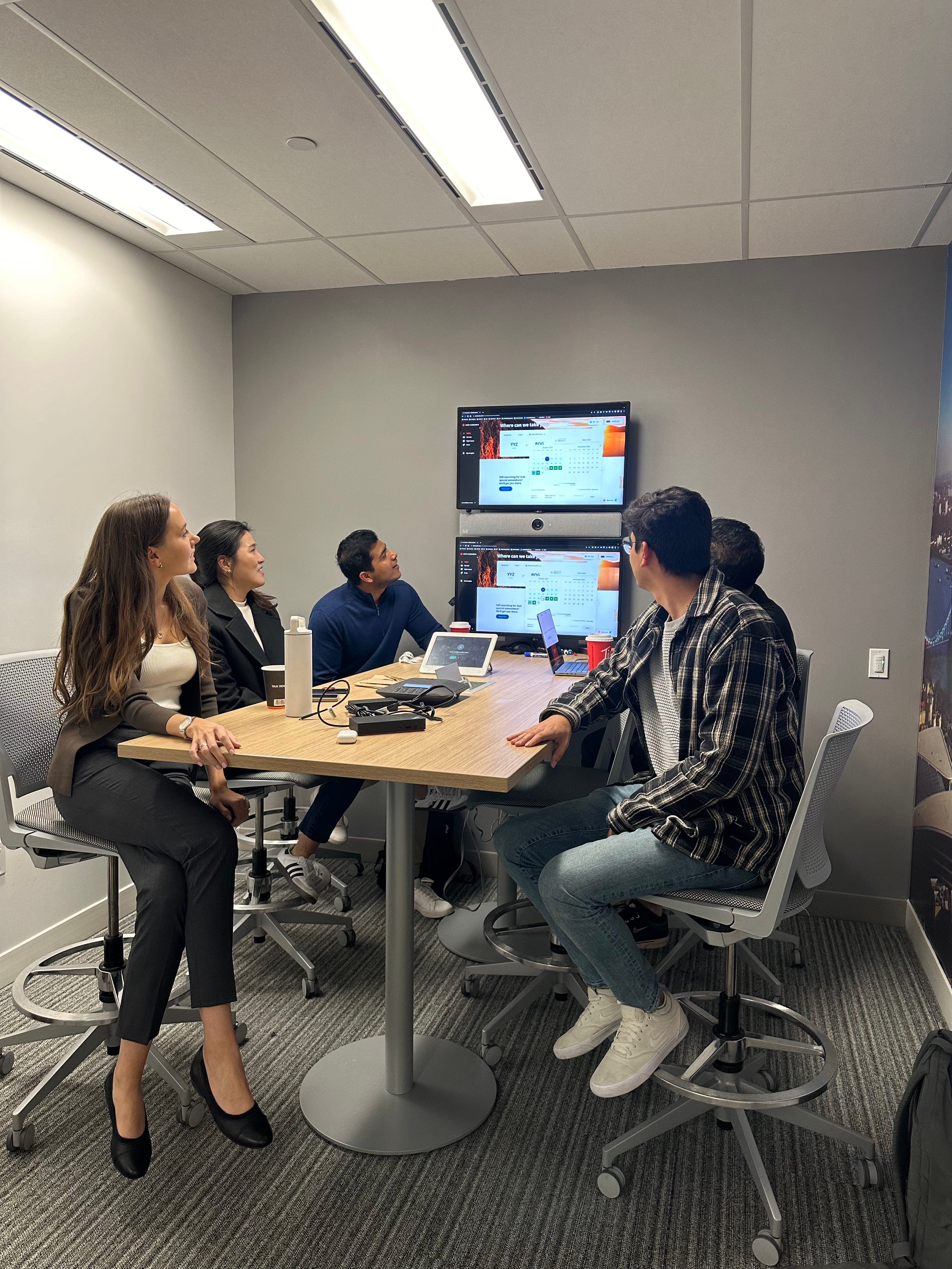
Then we tested. We stood in Air Canada’s YYZ Maple Leaf Lounge, approaching travelers mid-journey.
Customers who’d been flying for 16 hours, bleary-eyed and jetlagged, were still able to navigate the prototype with ease.
The best feedback came in one simple question:
“When does this launch?”
We kept hearing that magic phrase over and over. And that’s the phrase every builder should listen for when testing with customers.
👉 Builder tip: Make your UI a mirror of your core actions. If it takes more than one tap to get to their most common job-to-be-done, you’re already losing customers.
👉 Builder tip: Keep testing until you hear: “when does this launch?” over and over again from your customers.
4. Set the Team North Star 💫
Execution matters as much as design. Our engineering team was talented, but brand new to Air Canada’s tech stack, and up until this point working primarily on support tickets.
To rally them, I shared the same vision I’d presented to executives, but added one challenge:
“Team, we’re going to win a Webby Award for this design.”
👉 Builder tip: Team North Stars keep the team motivated through every bug, blocker, and sprint.
5. Launch in Beta 🚀
Launching a Beta is second nature in Silicon Valley, but it’s relatively uncommon for legacy organizations like Air Canada.
The idea clicked for me while listening to a lecture by Kate Tarling on her book, The Service Organization. She shared how so many digital initiatives fail because risk-averse organizations spend months, even years, building without feedback.
Then it hit me: the only way to get this redesign “approved” was to flip the script: launch in Beta.
We started presenting the same product to stakeholders, with one small change: we added a Beta toggle.
Suddenly we had buy-in.
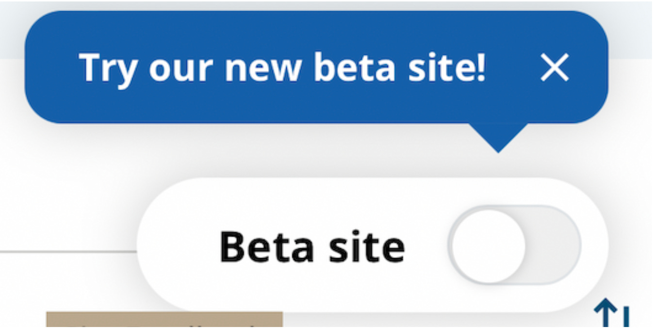
It worked. Nobody could say no to a Beta. We would watch the metrics, iterate, and ship incrementally.
We launched the Beta as an optional toggle, meaning the default was still the old homepage with a toggle to try the new Beta.
It was stripped down to the essentials: flight booking first, core travel tasks second.
The philosophy for the Beta was simple: launch an MVP fast, gather feedback even faster. I operated with this famous Reid Hoffman quote in mind:
“If you’re not embarrassed by the first version of your product, you’ve launched too late.”
- Reid Hoffman
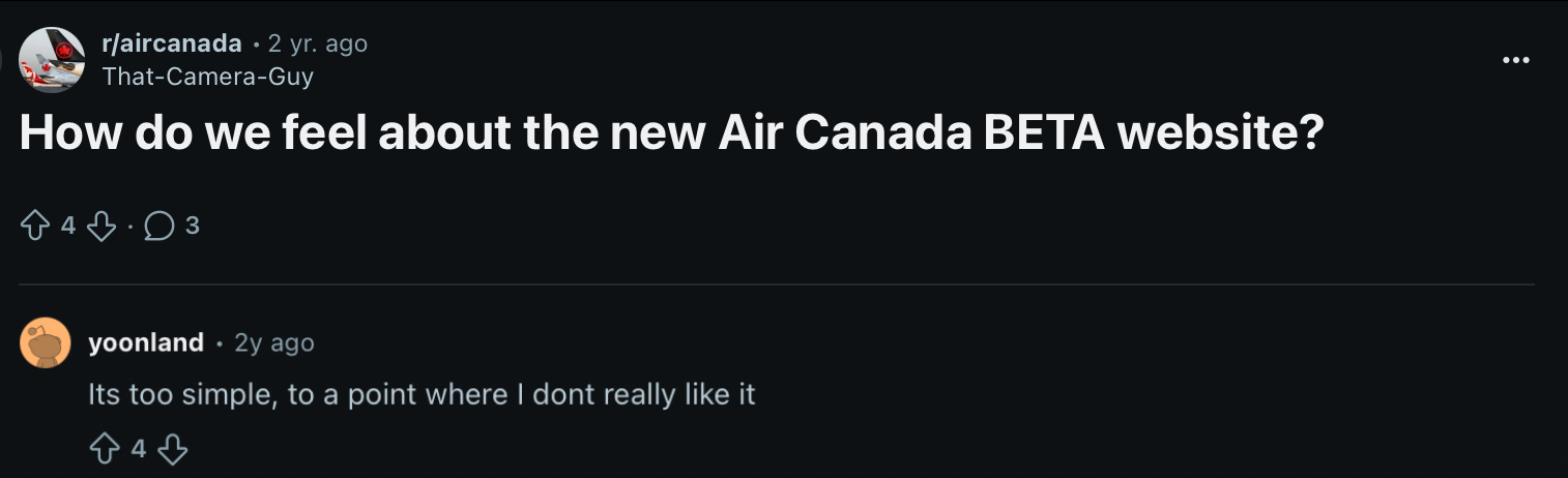
Sure enough, someone on Reddit complained the Beta homepage was “too simple.” Perfect. That was the point.
We launched the MVP Beta with Flights, My Trips, Flight Status and Flight Deals (notice how these map back to core customer actions), and slowly started launching more features each sprint.
👉 Builder tip: launch before you’re ready, but give users an “escape hatch” to go back to the old experience while you work out the kinks.
6. Refine Until You Can Release 🔧
Every sprint, we adjusted based on customer feedback. We collected input through a site feedback button and a pop-up survey, grouped themes using AI (but we also read every line of feedback as a team), and reprioritized the roadmap regularly.
The reality is: you won’t know the real issues until you’re live in production. That’s why shipping early mattered.
And I noticed something unexpected along the way…
The more openly I talked about what we got wrong, like deciding to launch without a check-in tab, the more credibility I earned.
In large organizations, people are used to polished status updates. Instead of weakening trust, sharing mistakes & lessons learned built it. Leaders leaned in more, teams felt safer to share feedback, and stakeholders trusted that when we said something was working, it really was.
👉 Builder tip: Treat Beta as a learning lab. Don’t just test: listen, learn, and iterate.
👉 Builder tip: Share your learnings openly.
6. Monitor the Metrics & Be Transparent 📊
In large organizations, risk-aversion can kill good ideas. So we over-communicated. Weekly demos, stakeholder updates, weekly automated analytics reports emailed directly to execs.
The signal that mattered most: did flight search improve?
When flight searches tripled compared to the old experience, it was clear the Beta was ready to graduate to default. Near this time, I moved onto another product, but Air Canada began tracking how many people would switch back. When the percentage of switch-backs was low, it was clear that the product was ready to be set at 100% and the old homepage could be sunset.
The result? A relatively uneventful & smooth launch, because most of the bugs had already been worked out in the Beta phase.
👉 Builder tip: Track adoption, switch-backs, and always over-communicate progress.
7. Protect the Simplicity🛡️
The hardest part isn’t launching Simple Mode. It’s keeping it simple.
Every stakeholder wants “just one more” feature. That’s why a PM’s favorite word is often “no”. Because every “yes” chips away at simplicity.
👉 Builder tip: As a Product Builder, you are the guardian of simplicity. Every proposed feature needs to earn its place.
The Happy Ending 🏆

Before leaving IBM, we entered the homepage redesign into the Webby Awards. Out of 13,000 entries, we were named an Honoree for Best User Experience.
That was the proof point: clarity wins.
The Future of Simple Mode in Travel 🌍
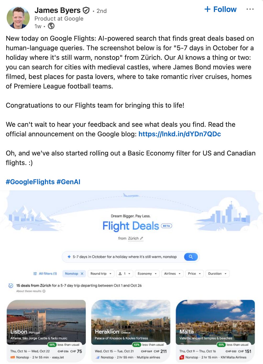
Travel is evolving quickly. Google Flights just launched AI-powered search.
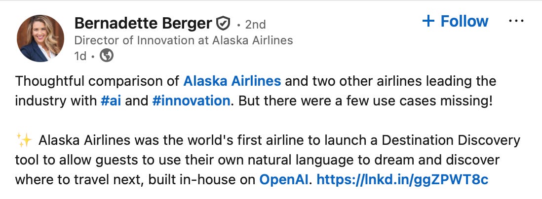
Alaska Airlines introduced an AI-powered Destination Discovery Tool, that works with loyalty points too.
Perplexity and OpenAI use booking flights regularly as the go-to demo for agentic AI use cases.
Pretty soon, the airline homepage may not exist at all.
But the simplicity principle will always endure:
👉 To simplify, you must understand the business deeply and the customer even deeper. Once priorities are clear, everything else falls into place. And yes, you need the guts to say “no”.
The Takeaway for Product Builders
Whether you’re:
✔️Redesigning an existing product
✔️Shipping something new
✔️Inheriting a product
✔️Or building “Simple Mode” into your product
The same discipline applies:
Anchor on revenue drivers
Obsess over core customer actions
Launch earlier than you feel ready
Refine until adoption sticks
Defend simplicity post-launch
Simple Mode isn’t a toggle. It’s a discipline.
Acknowledgements
Read Jose Platero’s co-published article about leadership lessons here.
This article and the work itself would not be possible without the real-life support & hard work of many dedicated individuals across Air Canada, IBM, and Amadeus. Special thanks to Jose Platero, Carlos Faxas, Danielle McLean, Tiana Heichert, Christine Lim, Bianca Adorante, and the Amadeus engineering team.
Diving Deeper on Simple Mode
Since seeing Uber create simple mode, I’ve become fascinated with what Simple Mode means for product builders. Here are 2 other articles to go deeper:
Your Product Needs Simple Mode.

Last week’s snippet on Uber’s Simple Mode took off on LinkedIn, so I thought we should double-click on Simple Mode.
PMs: Before you vibe code, read this.

Early product prototypes (like this one from Twitter) used to look like this: